     name hours score
1   Alice   5.0    57
2     Bob   8.8    83
3 Charlie   6.7    74
4   David   9.4    90
5 Eve 10.0 78Overfitting
Cross-validation, training and testing sets
- Every student ever
Let’s say a professor wants to help their students predict how much their studying will pay off on their final exam. The professor has data from a past semester, where they recorded how many hours each student studied and what their eventual final exam score was. The data looks like this:
The professor want to use this data to build a model that can predict a student’s final exam score from the number of hours they studied. The hope is that students can use this model to get a sense of how much they need to study, based on how high of a score they are reaching for.
The professor builds two different models using last semester’s data - one model is simple, one complex. Which one is better?
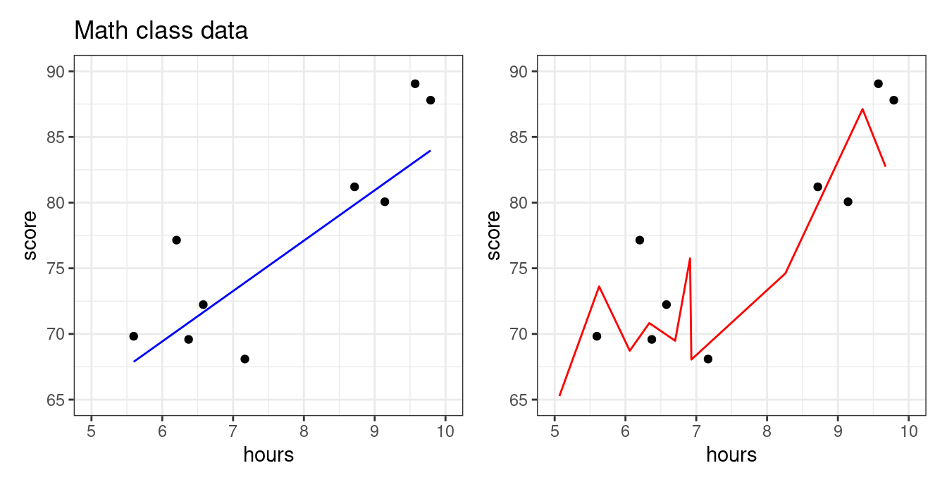
The dots are the students, while the lines visualize each models’ behavior: they show what score each model would predict for a student who studied some number of hours.
So which model is “better”? Some things to notice:
- The red model has a higher R². It literally explains the data better than the blue model.
- Look closely. The red model predicts a low exam score if you study 5 hours, a high score if you study 6 hours, but again a low score if you study 8 hours! In what world would this make any sense? You should study 6 hours, but not 5 or 8??
- The blue model, by contrast, keeps predicting slightly higher scores as you study more. This makes sense given how studying should work - more studying, more learning, better scores.
How do we reconcile this? The story of the red model makes no sense… yet it makes better predictions??
The whole point of building a predictive model is NOT to explain the data that you already have. It’s to make predictions in situations where you don’t yet know the outcome. The only thing that matters is that those predictions are as accurate as possible.
Here, the point of making a model is to predict exam scores for this semester’s students. Students know how long they spend studying (or plan to), but they don’t yet know their exam scores. The model is supposed to fill in the gap. Now we need to figure out which of our models will serve students better.
First, let’s have our models make some predictions for this semester. We’ll ask students how much they plan to study, then have the two models predict their exam scores:
   name hours prediction_simple prediction_complex
1 Frank   5.0              61.0               56.8
2 Heidi   6.1              66.9               83.5
3  Ivan   6.3              67.9               80.9
4 Grace   8.8              80.8               83.2
5  Judy  10.0              86.8               78.0
After the final, the professor looks at how the models’ predictions compared to the students’ scores:
The blue model does just fine. It’s in the right neighborhood for all students, roughly as expected. R² is pretty high, about the same as it was before.
The red model… is wild. It’s close for a few students, but way off for others. In fact, it’s so far off that the R² is negative – meaning that this model is worse than just predicting “all students will get a 75 on the exam, no matter how much they studied” (the “intercept-only” model).
What happened? Well, the red model tried so hard to be perfect on last semester’s data that it did a terrible job on everything else. In statistics and data science, we say that the red model was overfit.
- Overfitting
- Creating a predictive model that does well at explaining the data used to fit it, but makes bad predictions on new data.
Before we explain how to combat overfitting, let’s look more closely at how it happens:
Overfitting with polynomials
Usually, overfitting occurs as a result of applying a model that is too complex, like the red one above. We created that model by fitting a polynomial with a high degree: see the models’ formulas and coefficients below:
- Blue model:
- \(\hat{score} = 35 + 5 * hours\)
- Red model:
- \(\hat{score} = -6179 + 3140 * hours - 712 * hours^2 + 64 * hours^3 - 2 * hours^4\)
The blue model formula seems perfectly reasonable. Each hour of studying adds 5 points to your expected exam score.
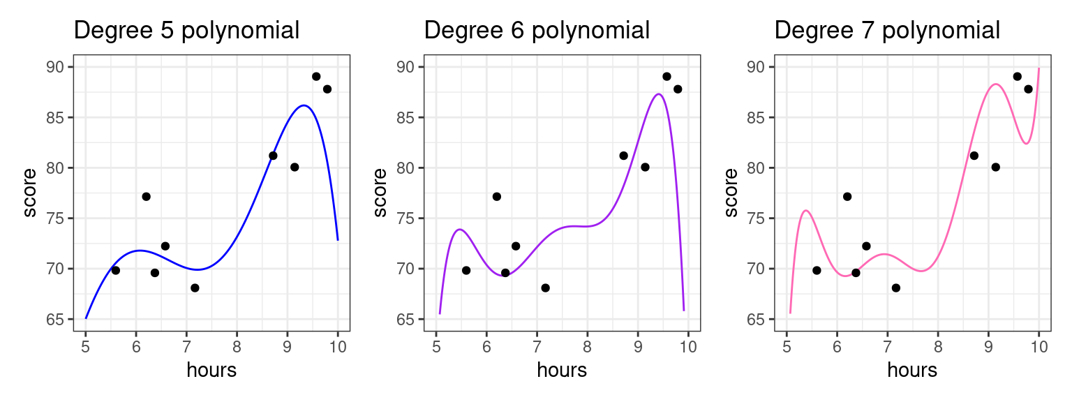
This red model formula is… weird and complicated. Polynomials are quite powerful, and are capable of creating very complex predictive functions. The higher the polynomial degree, the more complex function it can create, meaning the more it can twist and turn itself to fit the data. This works… but only if those twists and turns are actually real patterns. If the patterns only exist in the original dataset, the model will do badly on new data.

Let’s watch this develop by fitting polynomial models with progressively higher degrees. For each, we’ll fit the model with last semester’s students (our “training” data), and evaluate the model on this semester’s students (our “testing” data).
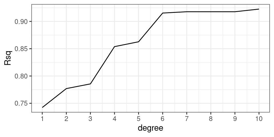
The higher the polynomial degree, the closer model comes to perfectly fitting the training data (R² keeps going up in the left column), but the WORSE it does on the testing data (R² keeps going down in the right column). If we had only looked how well these models fit the training data, we’d think the higher-degree polynomials were best. But if we evaluate the models honestly, by testing them on unseen data, we get the opposite conclusion! The simple, degree-1 polynomial (a straight line) is best.
It turns out that the true relationship between “hours studied” and “exam score” is actually linear here. This is fake data that we generated from a simple linear model with some noise: score = 37.5 + hours * 5 + rnorm(n = 5, mu = 0, sd = 8). Even without knowing this, we were able to discover this “true” relationship by testing our models on data they haven’t seen before. This is called cross-validation.
- Training Set
- The set of observations used to fit a predictive model; i.e. estimate the model coefficients.
- Testing Set
- The set of observations used to assess the accuracy of a predictive model. The model has never seen these observations before.
- Cross-validation
- The practice of splitting data into “training” and “testing” sets. We use the “training” set to decide what the exact model should do, and the “testing” set to evaluate how good it is.
Cross-validation: a workflow to curb overfitting
What you should have taken away so far is the following: we should not fit the model (find the coefficients) and evaluate the model (judge its predictive power) with the same data set!
But what if we only have one data set? Well, split it in two! We can simulate “testing our model on new data” by simply hiding some of our initial data from our model during training, then use the held-out data to test the model later.
The partition of a data frame into training and testing sets is illustrated by the diagram below.
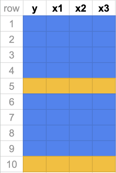
The original data frame consists of 10 observations. For each observation we have recorded a response variable, \(y\), and three predictors, \(x_1, x_2\), and \(x_3\). If we do an 80-20 split, then 8 of the rows will randomly be assigned to the training set (in blue). The 2 remaining rows (rows 2 and 6) are assigned to the testing set (in gold).
So to recap, our new workflow for predictive modeling involves:
- Splitting the data into a training and a testing set
- Fitting the model to the training set
- Evaluating the model using the testing set
More on splitting the data
As in the diagram above, a standard partition is to dedicate 80% of the observations to the training set and the remainder to the testing set (a 80-20 split), though this is not a rule which is set in stone. The other question is how best to assign the observations to the two sets. In general, it is best to do this randomly to avoid one set that is categorically different than the other.
Root mean squared error (RMSE): a more interpretable measure of model quality
We know \(R^2\) is a useful metric to evaluate the quality of a predictive model (higher = better), but it doesn’t give us a very intuitive sense of how close we expect our predictions to be to the truth. Maybe our model has an R² of 0.8. Does that mean our model will usually be within 5 points of the correct exam score? 25 points? 1 point?
A more interpretable metric is root mean squared error (RMSE), which gives us a sense of a “typical” prediction error for our model. It is very related to R². See below:
- In our testing data, we have the “true” exam scores (\(y_1\), \(y_2\), \(y_3\), …) and the model’s predictions (\(\hat{y}_1\), \(\hat{y}_2\), \(\hat{y}_3\), …).
- The difference between these are our prediction errors (residuals). \(e_1 = y_1 - \hat{y}_1\) and so forth.
- The squares of these errors are… the squared errors. \(e_1^2 = (y_1 - \hat{y}_1)^2\) and so forth.
- The sum of these squared errors is our residual sum of squares (RSS). \(\text{RSS} = \sum_{i=1}^n (y_i - \hat{y}_i)^2\).
- If we want to calculate R², we can use RSS and TSS: \(R^2 = 1 - \frac{\text{RSS}}{\text{TSS}}\) (where TSS is the sum of squared errors in the intercept-only model, which just predicts the mean everywhere).
- Instead of adding them up to get RSS, we could take the mean of these squared errors to get… the mean squared error (MSE). \(\text{MSE} = \frac{1}{n}\sum_{i=1}^n (y_i - \hat{y}_i)^2\).
- Taking the square root of mean squared error gives… the root mean squared error (RMSE). \(\text{RMSE} = \sqrt{\text{MSE}}\).
RMSE you can actually interpret. In our red and blue models:
- The blue model had an RMSE of 4.7 on the testing data. So its predictions were typically about 5 points off.
- The red model had an RMSE of 13.5 on the testing data. So its predictions were typically about 13 points off.
If your model gets better (your predictions get closer to the truth), RMSE goes down. This follows logically: if our predictions are closer to the truth, our errors get closer to zero. Which means our squared errors will go down. And the mean of these squared errors will also go down (MSE). And, of course, the square root of this will also go down (RMSE).
Just as the mean of your squared errors goes down, the sum of your squared errors (RSS) will also go down. This means that your R² will go up (\(R^2 = 1 - \frac{RSS}{TSS}\)). R² measures how much of the initial (squared) error you got rid of, so if you have less error at the end, it means you got rid of more along the way. Hence, R² is higher.