Flights
Part II: Computing on the Data
The data for this lab can be found in the flights data frame in the stat20data package. Run ?flights at the console to learn more about the columns. Where applicable, answer each question with one pipeline, which may include dplyr code, ggplot2 code or both.
Question 1
How many flights in the dataset left in the springtime and were destined for Portland, Oregon?
Question 2
Create a new variable called avg_speed that is the average speed of the plane during the flight, measured in miles per hour. Save it back into the data frame; you’ll use it later on.
Question 3
Arrange the data frame to figure out: what is the destination and delay time (in hrs) for the flight that was most delayed?
Question 4
Arrange the data frame to figure out: what is the destination and delay time (in hrs) for the flight that was least delayed, i.e. that left the most ahead of schedule?
Question 5
What proportion of all of the flights left on or ahead of schedule? For Oakland and SFO separately, what proportion of flights left on or ahead of schedule?
Question 6
How many flights left SFO during March 2020?
Question 7
How many flights left SFO during April 2020?
Question 8
Create a bar chart that shows the distribution by month of all the flights leaving the Bay Area (SFO and OAK). Do you any sign of an effect of the pandemic?
Question 9
Create a histogram showing the distribution of departure delays for all flights. Be sure to
- set the limits of the x-axis to focus on where most of the data lie,
- add a text annotation that explains the meaning of a negative departure delay,
- and below the plot write 1-2 sentences that describe the shape and modality of the distribution.
Question 10
Create a data frame that contains the median and interquartile range for departure delays, grouped by carrier. Which carrier has the lowest typical departure delay? Which one has the least variable departure delays?
Question 11
Create a plot that captures the relationship of average speed vs. distance and describe the shape and structure that you see. What phenomena related to taking flights from the Bay Area might explain this structure?
Question 12
For flights leaving SFO, which month has the highest mean departure delay? What about the highest median departure delay? Which of these measures is more useful to know when deciding which month(s) to avoid flying if you particularly dislike flights that are severely delayed?
Question 13
Each individual airplane can be uniquely identified by its tailnumber in the same way that US citizens can be by their social security numbers. Which airplane flew the farthest in total during this year for which we have data? How many times around the planet does that translate to?
Question 14
What is the tailnumber of the fastest plane in the data set? What type of plane is it (google it!)? Be sure to be clear how you’re defining fastest.
Question 15
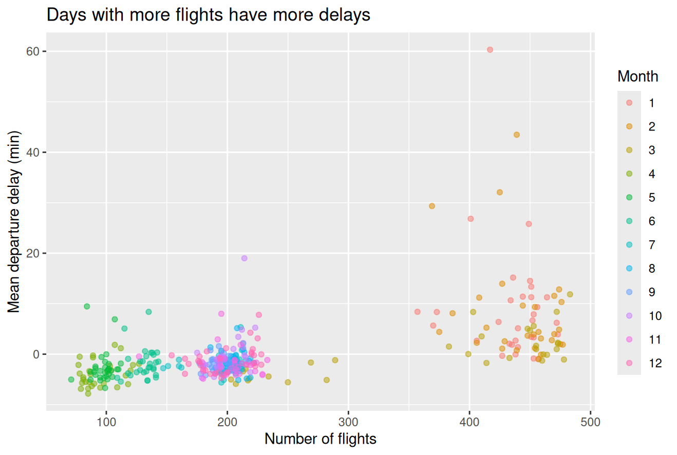
The plot below shows the relationship between the number of flights going out of SFO and the average departure delay. It illustrates the hypothesis that more flights on a given day would lead to a more congested airport which would lead to greater delays on average. Each point represents single day in 2020; there are 366 of them on the plot. Please form a single pipeline that will create this plot, starting with the raw data set.
Question 16
Create a plot to illustrate the association between departure delay and arrival delay. Summarize the linear relationship by calculating the correlation coefficient and by fitting a linear model and showing the value of those statistics (this requires two multiple pipelines). For an optional challenge, use geom_smooth() to superimpose the linear model on the scatter plot.
Question 17
Which flight has the longest arrival delay given its departure delay?
Question 18
Fit a multiple linear regression model that explains arrival delay using departure delay and the distance of the flight and print out the coefficients (the intercept and two slopes). Speculate as to why the sign (positive or negative) of the distance coefficient is what it is.
Question 19
On average, which carrier’s flights had the smallest arrival delay given their departure delay and distance?
Question 20
Can we compare the regression coefficients for departure delay and distance to understand which has the stronger relationship? Why or why not?
Last Question
Will you ensure that your submission to Gradescope…
- is of a pdf generated from a qmd file,
- has all of your code visible to readers,
- and assigns each of the questions to all pages that show your work for that question?
(This one is easy! Just answer “yes” or “no”)